When discussing data visualizations it can be overwhelming deciding what type of chart to use where. Am I presenting the data clearly? Does the it make sense to the customer? Is it asthetically pleasing? Here we are going to go over some of the most common types of data visualizations and how to use them in your notebook.
For all below graphs I am modeling seaborn. Coding information can be found at seaborn.pydata.org
STEP ONE:
import seaborn as sns
STEP TWO: Choose your visualization
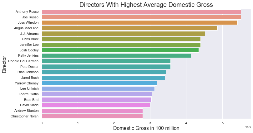
Barplot
Barplots use bars to show comparative data. Barplots can be created horizontally or vertically. Best practice is that a horizontal barplot would be used with longer bars whereas a vertical barplot can be used for positive or negative data. With the code below I created a horizontal bar graph comparing movie directors and the domestic gross their movies brought in.
CODE:
f, ax = plt.subplots(figsize=(12, 6.5))
sns.barplot(y= 'primary_name', x= 'avg_domgross',
                data=df, ax=ax)

ax.set_title('Directors With Highest Average Domestic Gross', fontsize = 20)
ax.set_ylabel('Director', fontsize = 16)
ax.set_xlabel('Domestic Gross in 100 million', fontsize = 16)
*Some additional useful options to use on barplot are hue, hue_order, orient (for vertical or horizontal), color, palette, saturation
Barplot:
Distplot
Distplots are useful to see the distribution of data. Much like a histogram, but with a line over it for additional visualization. This distplot below shows the distribution of runtime for movies.
CODE:
ax = sns.distplot(df1['runtimeMinutes'])
Distplot:
.png)
Regression Plot
Regression plots are much like scatterplots except there is a line added to show regression. (Basically a line through the scatterplot data to show how x and y relate). Scatterplots themselves are used to show a correlation between data and how one variable is impacted by another. The closer the correlation the tighter the points will be together. The example I used below is to show movie runtime vs. audience ratings.
CODE:
f, ax = plt.subplots(figsize=(6.5, 6.5))
sns.despine(f, left=True, bottom=True)
sns.regplot(x= 'runtimeMinutes', y= 'averageRating',
                data=df, ax=ax, line_kws = {'color':'red'})

ax.set_title('Runtime vs. Ratings', fontsize = 20)
ax.set_xlabel('Runtime (min)', fontsize = 16)
ax.set_ylabel('Average Rating (1-10)', fontsize = 16)
ax.set(ylim=(0, 12));
- Some additional useful options to use on a regression plot are style, legend, hue, size, palette, hue_order, sizes, linewidth
Regression plot:
.png)
Boxplot
Boxplots are great to use with data where you want to show specifics. Examples of this are showing the mean, median, standard deviations, and the IQR. Boxplots are also useful in showing that outliers exist in a given set of data. Below I modeled using a boxplot with runtime. This way we can see the average length of a movie as well as those really long movies as outliers.
CODE:
ax = sns.boxplot(x=df["runtimeMinutes"], showmeans = True)
Boxplot:
.png)
Stacked Barplot
Much like the original barplot, a stacked barplot allows the viewer to see relative differences between two categories. The example below compares movie genres vs. Domestic and Worldwide gross.
CODE:
sns.set(style="darkgrid")

f, ax = plt.subplots(figsize=(6, 15))

dom_ww = dom_ww.sort_values("avg_wwgross", ascending=False)

sns.set_color_codes("pastel")

sns.barplot(x="avg_wwgross", y="genres", data=dom_ww,
            label="World Wide Average", color="b")

sns.set_color_codes("muted")
sns.barplot(x="avg_gross", y="genres", data=dom_ww,
            label="Domestic Average", color="b")

ax.legend(ncol=2, loc="lower right", frameon=True)
ax.set(ylabel="",
       xlabel="Average Gross by 100 Million",
       title= "Domestic vs. Worldwide Gross by Genre")
sns.despine(left=True, bottom=True)
Stacked Barplot:
.png)